


Imagine sleep feels softer – maybe soft blankets or quiet music pop up, perhaps even doing the same thing each night before bed. Yet, ever paused to wonder what shade your walls are? Research hints that nearby colors quietly shape how relaxed you feel – which could shift how deeply you rest.
Color psychology isn’t just stuff you hear in art class – it’s backed by real research. The shades around you after dark could affect your mood, how quickly you fall asleep, maybe even your total sleep time. Choosing specific colors may help your mind realize it’s time to wind down.
Ever wondered which color makes you feel sleepy? Take a look at how tones and brightness affects your mind, since certain colors might help shape your room into a real rest zone.
The Science of Light and Melatonin: Why Color Isn’t Just Visual
Sleep gets better after melatonin kicks in – a natural chemical your body makes when daylight fades. As night falls, this hormone signals your brain to slow down; still, the type of light around you affects how much of it gets released.
1. How Light Colors Affect Melatonin
A soft glow plays a big role once your body starts winding down. Dim or harsh lights at night can fool your head into thinking day’s still going, while gentle shades help ease things toward sleep instead.
- Blue light — Finding it in screens, lamps, or household lights – it mimics daylight, fooling your brain into thinking it’s still daytime. When night hits, exposure keeps your system from releasing melatonin, the signal that tells you to rest. Which is why scrolling your phone late throws off your body’s usual bedtime cues.
- Warm light — Light that feels like late sun tells your body it’s winding down. Swap bright bulbs for cozy ones, so your mind picks up the cue to relax. This mellow vibe lines up with your inner clock, guiding you into rest without abrupt shifts.
- Bright white light — Common in workspaces like kitchens or bathrooms, this strong glow sharpens attention and keeps you awake. It helps get things done during the day but messes with sleep if used too late. Skip these bulbs at night since they fire up your mind, making it tough to wind down.
2. Why Color Affects the Brain
Color’s more than just what meets the eye – it plays a role in how your body functions too. When your eyes catch light, they relay messages to your brain, influencing your nerves right away.
- Muted shades – beige, gray, or soft blue – ease mental tension while reducing anxiety.
- Bright or saturated shades – for instance, red or neon tones – can spark alertness and hype, which might make it tougher to relax.
3. Creating a Sleep-Friendly Space
To get your body ready for sleep:
- Try cozy-colored lights or small lamps at night.
- Pick light wall tones – or go for natural ones like beige, muted green, maybe blush.
- Avoid bright ceiling lights at night – use soft, diffused lighting as an alternative.
When you see how light plus color affect melatonin, your bedroom can become a spot that matches your body’s real rhythm – making it easier to relax quicker and rest harder.
The Winner: Why Blue Is Universally Recommended for Better Sleep
People usually find the blue color super calming, yet research backs that up with real data. While it seems gentle to the eye, it actually changes how your brain and body shift toward rest. Instead of holding tension, this shade helps quiet your mind, settle breathing patterns, so sleep comes more naturally.
1. How Blue Calms the Body
Blue tones quietly calm your pulse while easing pressure in your blood vessels, nudging your system away from stress. As your brain picks up these cues, relaxation kicks in on its own – muscles unwind, tightness slips away. This is why stepping into a room filled with blue after hours of activity brings quick relief – it tells your body without words that rest can begin now.
2. Why Soft Blues Work Best
Light blue tones remind the mind of the open sky and calm ocean, both symbols of peace and freedom. These muted hues give rooms airiness, keeping the mood serene without feeling distant. A subtle mix of chilly blue with soft warmth – think beige or off-white – finds harmony, setting up a relaxed, inviting tone that helps you drift off.
3. The Sleep Connection
Blue might spark serotonin release that is a brain chemical that calms things down and smooths out mood swings. When emotions feel steadier, drifting off without stress or mental chatter gets way simpler. A sleep experiment showed folks in rooms with blue walls averaged close to eight hours of rest nightly, way more than people in spaces colored differently.
4. Bedroom Tip
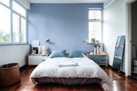
To use blue well, go for a light blue-gray tone on walls, sheets, or drapes. Pair it with cozy materials such as woven blankets or linen cushions so the room feels snug and welcoming. That mix builds a soothing vibe where your muscles relax and thoughts slowly settle into rest.
Calm and Earthy: Exploring the Benefits of Neutral Tones (Gray, Beige, and White)
Some folks don’t care for blue – and honestly, no problem there. Shades such as pale gray, beige, cream, or even muted white work just as well when winding down. These hues give off a simple, tidy vibe that cuts down on visual noise, which often keeps people wired at night.
Earth shades bring to mind sand, rocks, maybe sunlight – giving off calm, grounded feels. A space in beige or pale gray works nicely with cozy sheets, gentle lighting, along with quiet fabric details that help you unwind.
For a quieter vibe, go with gentle light from lamps rather than ceiling fixtures. Warm-toned bulbs (under 3000K) pair well here, matching those shades while copying the feel of sunset light.
The Warm Danger Zone: Colors to Strictly Avoid in the Bedroom (Red and Bright Orange)
At the other end sit hues that might wreck your sleep. Red, along with bright orange or neon tones, tends to boost alertness and speed up heart rate. Though bright shades fit fine in busy spots, let’s say, workout rooms or offices, they don’t suit sleep spaces quite as much.
Red grabs attention – it fires up strong emotions because it’s tied to energy, movement, or alerts. In a bedroom, that punch could stop your body from relaxing easy.
If you’re into a warm feel at home, go for softer picks – think terracotta, peach, or dusty rose instead. They keep things comfy but don’t overwhelm your eyes or mind.
Going Green: How Soothing Shades of Nature Promote Relaxation
Green sits high on the list of chill colors. Linked to nature, fresh starts, or quiet moods, soft greens give your mind space to unwind when the sun dips below the horizon.
Pastel shades like sage or mint add cool, gentle vibes without being loud. Experts mention green clears mental clutter and yet it eases the shift from daily chaos into deep calm.
Try green walls with linen textures, use rattan instead of metal touches, toss in some wood furniture – it ties that relaxed feel into one look.
Beyond the Walls: Using Color in Bedding, Decor, and Ambient Lighting
Your bedroom’s colors aren’t only about the walls. Bed sheets chip in with their own vibe, meanwhile curtains toss in something extra like mixing together to shape your nighttime unwind.
Go for comfy materials that let air move through when picking out sheets, maybe go with peaceful shades such as sky blue, cream, or gentle gray. Skip loud designs that shout; quiet weaves with a silky feel usually make unwinding easier.
Lighting matters just as much. Ditch bright overhead bulbs, go for a soft-glow lamp by your bed instead. If drifting off feels tough, pair calming colors with gentle tunes from infant sleep machine.
Momcozy’s sound machines pair soft lights with soothing sounds, helping parents and kids drift off easily. This combo creates a rich sensory vibe, resulting in more hours of quiet rest.
Final Verdict: Designing a Sleep Sanctuary Based on Chromotherapy Principles
Color therapy, also known as chromotherapy, has been around forever helping people shift how they feel or handle stress. Used in your bedroom, it might change how your body reacts when you’re trying to relax.
Soft blues calm the mind, while gentle greens help you feel more connected to the ground; earthy neutrals add cozy depth without trying. Skip reds that shout or oranges that overwhelm – they make a space buzz when quiet is what you’re after.
Picking bedroom colors like these does more than please the eye, it helps sync with your body’s sleep cycle. Try soft hues alongside dim lighting, minimal clutter, or faint sounds to turn the room into a calm retreat.
Your bedroom might turn into a calm escape each night, provided decisions are mindful, connecting improved comfort to sharper thoughts.